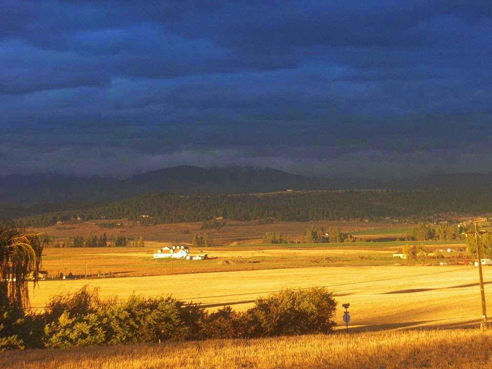
Okay, while I haven't yet designed the cover, I thought I'd post the two pictures and let y'all vote :)
Which one do you think would be better for the cover of Dark Storm Rising, A or B?
Let me know in the comments!!
Even though I haven't finished reading your book yet, I think picture A would be better because B is a landscape picture and it's a lot of field. A also looks more like a book cover. But it's your choice.
Even though I haven't read it..(which I should soon because I am figuring out how to manage all my school) {something I should have done a looooong time ago}. I think A. Goes better with the tittle and as a book cover


The first one (A) seems better. It's a little more "dark" if you know what I mean. ;P
ReplyDeleteSuper excited for your book!
Even though I haven't finished reading your book yet, I think picture A would be better because B is a landscape picture and it's a lot of field. A also looks more like a book cover. But it's your choice.
ReplyDeleteBtw, your book is awesome so far! =D
Hmm...I like both!;)
ReplyDeletePic. B. Is probably my favorite, but I think A. goes better with the title.
I think A. It makes much better sense with "Dark Storms Rising" it really looks like a storm that is growing, rising.
ReplyDeletePicture A.
ReplyDeletemy mom votes picture B.
DeleteEven though I haven't read it..(which I should soon because I am figuring out how to manage all my school) {something I should have done a looooong time ago}.
ReplyDeleteI think A. Goes better with the tittle and as a book cover
Does this mean you will be self-publishing it? For sure?
ReplyDeleteThis means I'm, working on it :) I have no idea how long it'll take to finally get it there, but, yes, I'm self-publishing it :)
DeleteWow, thank's everyone for voting! It was a big help to me :D
ReplyDeleteI like both but I think that my favorite one is B
ReplyDelete